Toronto Markham Airport – Branding & Visual Identity
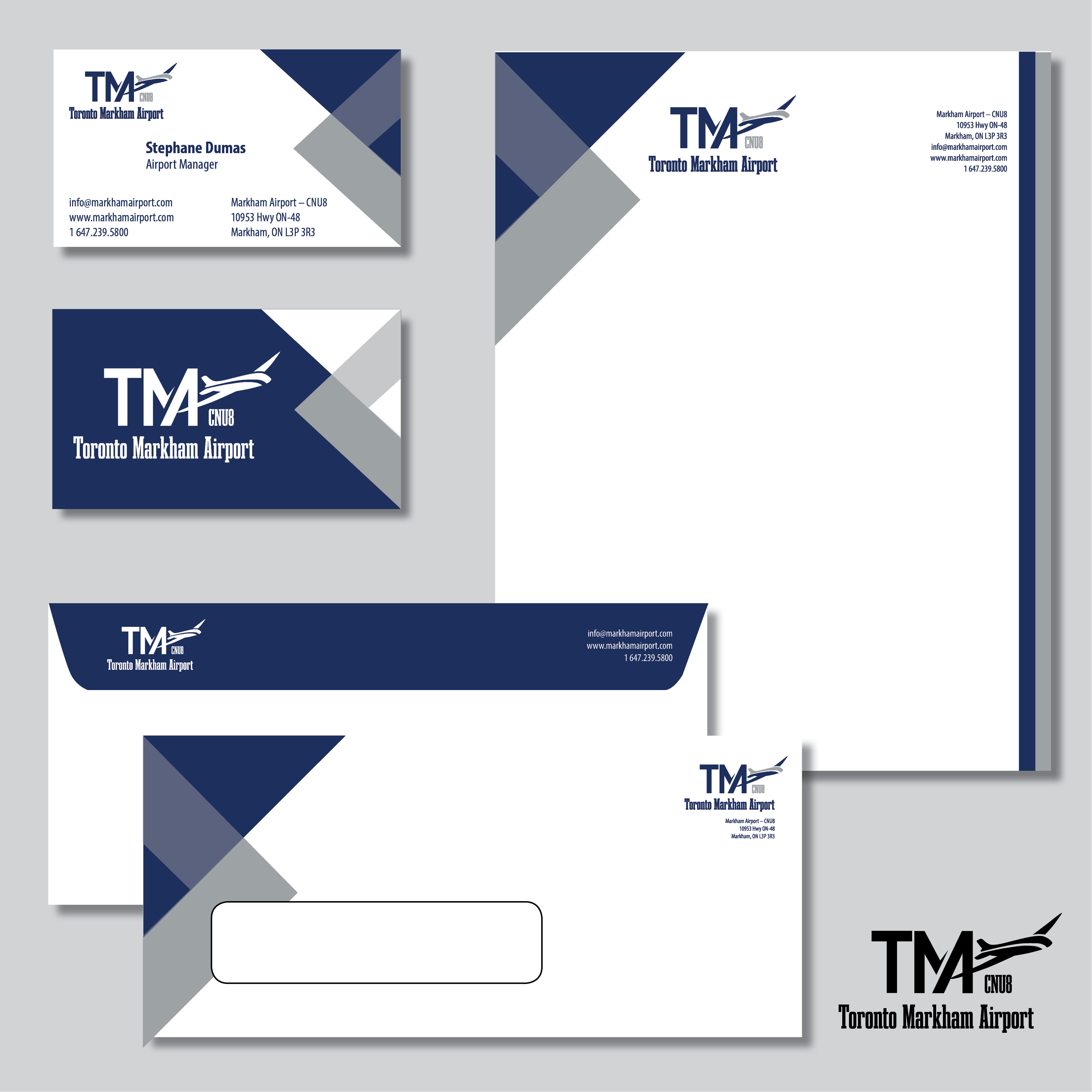
AT Spectrum Design developed a complete corporate identity for Toronto Markham Airport, including the logo, colour palette, and a structured visual system inspired by aviation and directional movement.
The design language is built around bold geometric forms, sharp angles, and a restrained navy and grey colour palette, reflecting precision, clarity, and operational reliability.
Presented through core printed materials such as business cards, envelopes, and letterhead, the identity establishes a strong institutional presence and a consistent foundation for all future communication.