Choosing the Right Colors for Your Brand Personality
Color is often the first thing people notice about a brand. Before reading a single word, customers respond emotionally to what they see. The right palette can communicate trust, elegance, creativity, or warmth within seconds.
Choosing brand colors is not only about personal preference. It is about selecting tones that reflect personality, support your message, and help people recognize your business consistently.
Why Color Matters in Branding
Color influences perception, mood, and memory. When colors are used consistently across a website, social media, print, and marketing materials, the brand becomes easier to recognize and remember.
A thoughtful palette makes a business feel intentional and professional. It also creates a visual rhythm that customers learn to associate with your brand over time.
How Color Shapes Brand Personality
Different color families communicate different qualities. A palette can feel calm or bold, modern or traditional, playful or refined. The goal is to choose colors that match the way you want your business to be perceived.
- Blue tones often suggest trust, stability, and professionalism.
- Warm neutrals can communicate comfort and approachability.
- Green hues often express balance, wellness, and natural values.
- Dark contrast can create sophistication and strength.
- Soft pastels can evoke elegance and calm.
- Bold accents can communicate confidence and energy.
Color Palette Examples
Below are examples of color moods that support different brand personalities. Each palette creates a distinct impression, even before a customer reads about services or pricing.
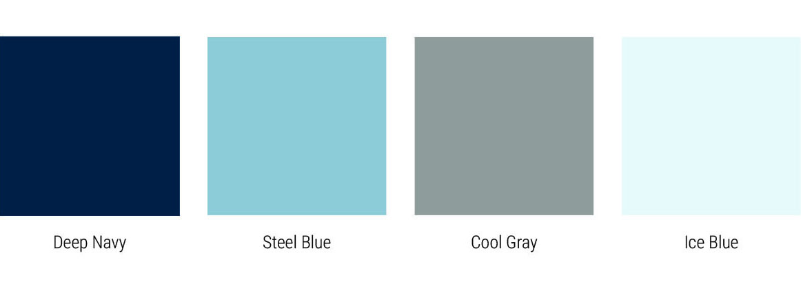
Trust & Professional
Reliable tones that communicate stability and confidence. Great for service businesses, consultants, and established brands.
Elegant & Premium
Soft luxury tones that suggest refinement and exclusivity. A strong fit for boutique brands, beauty, and high-end services.

Natural & Wellness
Organic hues that reflect calm, health, and balance. Ideal for wellness, organic products, and nature-inspired brands.

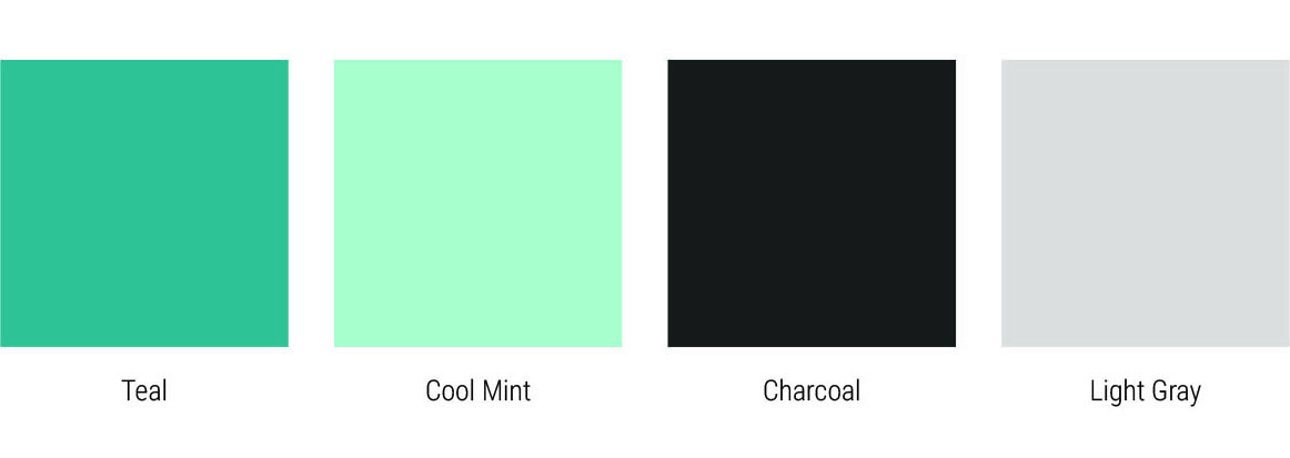
Creative & Modern
Fresh tones that feel innovative and forward-thinking. Great for creative studios, modern services, and tech-focused brands.
Warm & Friendly
Welcoming colors that create comfort and connection. Well suited for brands that value trust, care, and personal connection.

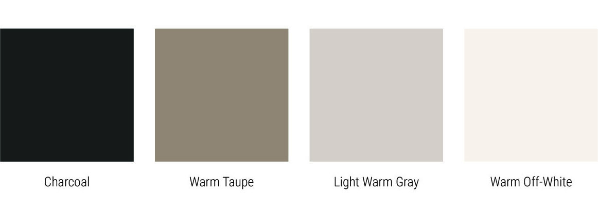
Minimal & Neutral
Soft neutrals that create calm, modern sophistication. Ideal for interior design, architecture, and premium minimal brands.
Bold & Confident
Strong contrast that communicates energy and presence. Great for brands that want to stand out while still looking refined.

How to Choose the Right Palette
When selecting colors for your brand, start with the emotions you want customers to feel. Then think about the audience you serve and where your brand will appear most often.
- Choose colors that match the personality you want to communicate.
- Consider your industry and how you want to stand out from competitors.
- Make sure the palette works for both digital and print materials.
- Keep it simple – a few well-balanced tones are easier to use consistently.
Final Thought
Color is more than decoration. It is a visual language that shapes how people perceive and remember a brand. A thoughtful palette creates connection, recognition, and confidence.
Looking to build a cohesive color identity for your brand?
Contact AT Spectrum Design